This article was first posted on LinkedIn: Visualize your LinkedIn data with Kibana
Did you know you can export your LinkedIn data (messages, profile, contacts…) and download a CSV file with a couple clicks? Well, I did not!
I know what you are thinking: a CSV file isn’t that cool and what’s the point in downloading my messages or contacts when I can see them on LinkedIn?
If you want to send a message, or you are looking for a job, or a candidate, LinkedIn is great. But do you receive more offers now than a year ago? What’s the answer rate? What’s the evolution of messages that mention «remote work» for example? How about answer rate and remote work combined? You know what I mean?
We can answer questions like that and maybe discover something new with Kibana.
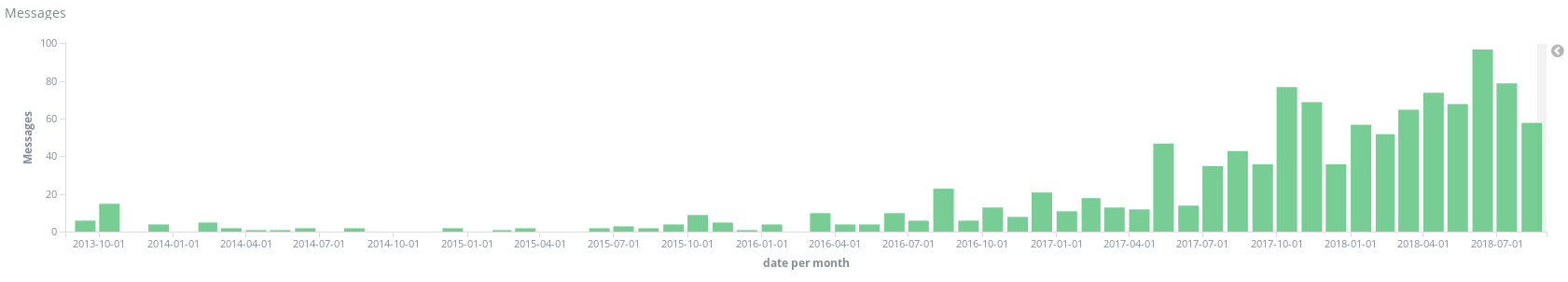
LinkedIn messages over time
I always like to start with just an overview of the data over time. No filters, just messages over time for the last 5 years. Simple uh? But you could do that with Excel too. Let’s add some filters, for example incoming and outgoing messages and also a couple visualizations to the dashboard.
Message language. I have used a small library to guess the language of the message so I can filter or plot that information and more importantly see if it changes when I apply other filters.
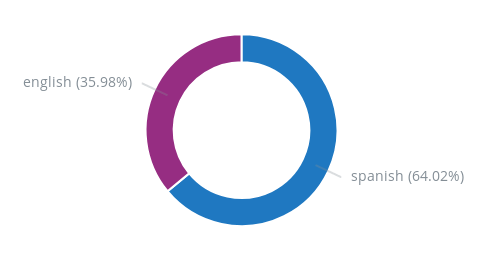
Message language
Here is another one: ignored messages. In other words, conversations that never got a reply for whatever reason ?. Maybe we could find something that all those ignored messages have in common… Well, just click that red slice and the whole dashboard will update now showing ignored messages only: if there is a link between unanswered messages and language, the first visualization will change instantly. If not, well, you will have to plot more metrics and explore further ?
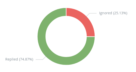
Ignored messages
Need ideas? Maybe adding a message length visualization helps. Or maybe messages that mention a specific technology to see if that has any effect on response rate. How about a salary range graph over time? Can you do this on LinkedIn?
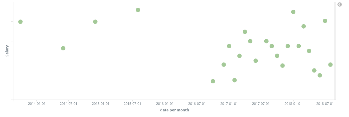
Salary over time
Or messages by day of week, incoming and outgoing. Turns out Sundays are quite busy!
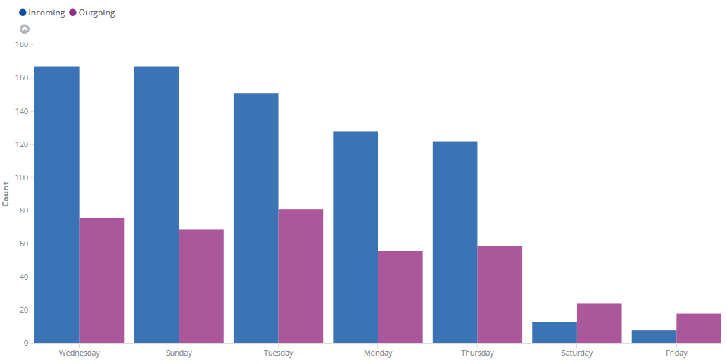
Messages by day of week
Those are just a few examples but you get the idea. Exploring data with Kibana is really easy. Just add a few visualizations and try to answer the questions that are important to you.
Maybe you can improve the way you use LinkedIn or find out some data to support a decision regarding job/candidate search. You can also track some metrics over time to see the evolution or try out something new and see the results. I don’t know, it is up to you.
It is worth mentioning that the LinkedIn data is quite raw: all you have is the message content, subject, date and author. You can search for «java» into the content, but if you want to do more precise queries like for example salary greater than x, or message language or if you want to plot cities on a map… you will have to parse that before going to Kibana. I have parsed just a few things for this example but it should be easy to extend and adapt.
The code is on my Gitlab: linkedin-stats. I have included a dashboard and a few visualizations so you can import them on Kibana in case you want to test it out with your own messages. You can use the ElasticSearch + Kibana 14 day trial, it’s easy and works really well. All you need is your CSV file and Node.js installed to parse the messages and upload them to Elastic.
I hope this was helpful or at least interesting! Feel free to message me if you have any ideas or questions or if you just want to say hi ✋